App redesign
H1 2024
Gumtree.com
During the Gumtree iOS and Android app redesign, I led the redesign of seller journeys, including ad creation, management, and partner integrations. I established the foundations of a cross-platform design system using design tokens (prior to Figma Variables) to ensure consistency and scalability. Working closely with engineers, I tackled complex multi-category constraints and validated key decisions through usability testing. The redesign delivered measurable improvements compared to the legacy app, increasing replies by 8%, driving a 15% uplift in revenue, and maintaining stable platform retention.
- Role
- Senior Product Designer (App Redesign, Design System → Seller Journeys)
- Team
- 3 Product Designers, Product, Engineering
- Scope
- Greenfield app redesign, design system foundations, seller listing & management flows
- Impact
- Unblocked app rebuild, enabled light/dark mode, reduced UX debt, improved listing creation and revenue stability
- Constraints
- Legacy codebase, WebView pivot, payment limitations, tight delivery deadlines
Outcome
Before we dive into the project details, here's a snapshot of the impact we delivered.
Context & Constraints
Gumtree is a UK marketplace operating within a previously centralised global app platform managed by eBay. Over time, this resulted in a legacy iOS and Android app with outdated architecture, slow iteration cycles, and increasing user dissatisfaction driven by bugs, performance issues, and inconsistent UX.
As the global platform was decentralised, Gumtree took ownership of its app experience and made a strategic decision to rebuild the app as a greenfield product. The challenge was to modernise the experience while operating under significant technical constraints, tight delivery timelines, and parallel streams of work.
The redesign ran across two tracks in parallel: establishing a scalable design system to support long-term development, while redesigning core user journeys to deliver immediate business impact.
Business Problem
The Gumtree mobile app was built on a shared global platform that limited Gumtree's ability to iterate and respond to local user needs. Over time, this resulted in significant technical and UX debt, making core journeys slow, complex, and difficult to evolve.
Performance issues and fragile seller flows increasingly impacted user satisfaction and revenue-critical behaviour. Following the decentralisation of the global platform, Gumtree needed to modernise the app while maintaining engagement and revenue, and establish foundations for faster, more reliable product development.
Objectives & Success Metrics
Objective
Deliver a greenfield iOS and Android app that modernises the seller experience while maintaining existing engagement and revenue, and establishes a scalable foundation for rapid iteration and future growth.
Success Metrics
The primary objective was to launch a greenfield mobile app that modernised the seller experience while preserving existing engagement and revenue. Success was measured by maintaining platform retention (~45%), increasing replies to seller listings, and keeping ad-related revenue stable or improving compared to the legacy app.
Strategy & Approach
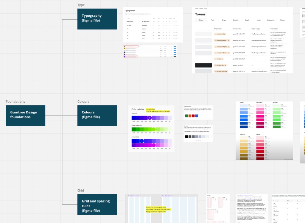
To avoid repeating the problems of the legacy app, we started by putting strong foundations in place. I focused on creating a scalable, token based design system that allowed teams to design and build consistently across iOS and Android, and made later product work faster.
Once the system was ready, we concentrated on seller journeys with the biggest business impact. We mapped existing app and web flows to understand how things worked, where they broke down, and where features were missing. Based on this, we redesigned the key native journeys to make them clearer and easier to use.
Later, technical constraints required parts of the seller flow to move from native to WebView. We adjusted the designs to keep the experience feeling connected and tested the most sensitive steps with users to make sure the changes did not negatively affect payments or revenue.
Long story short
Milestones
Foundation
I audited the legacy app.
To avoid repeating legacy UX and technical debt, we invested in a design system before redesigning core journeys. I questioned old patterns and explored how modern systems scale.
Direction
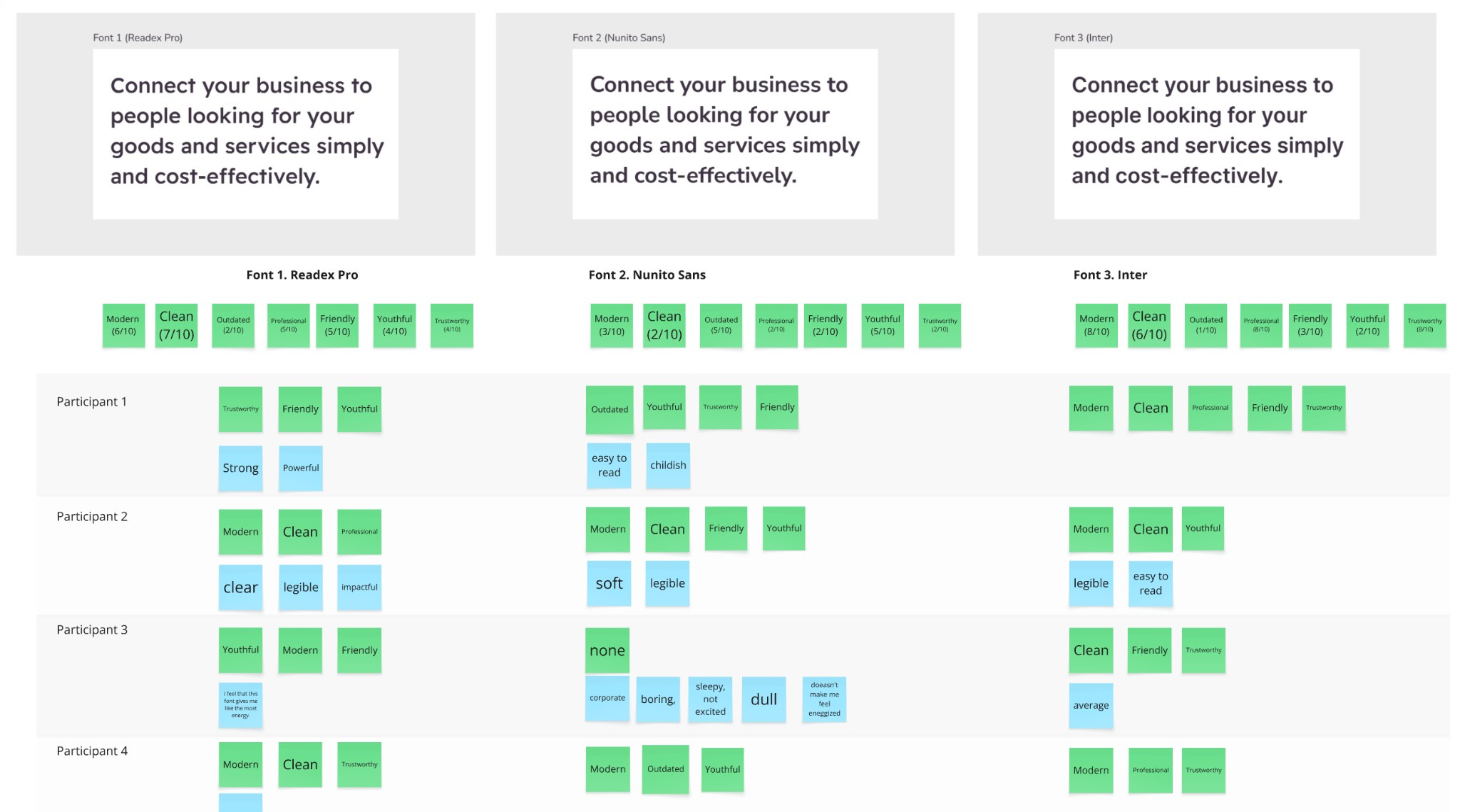
I ran usability testing to select a new typeface, evaluating Inter (current), Nunito Sans, and Readex Pro. Readex Pro scored highest on friendliness, trust, and modernity and became the new Gumtree typeface.
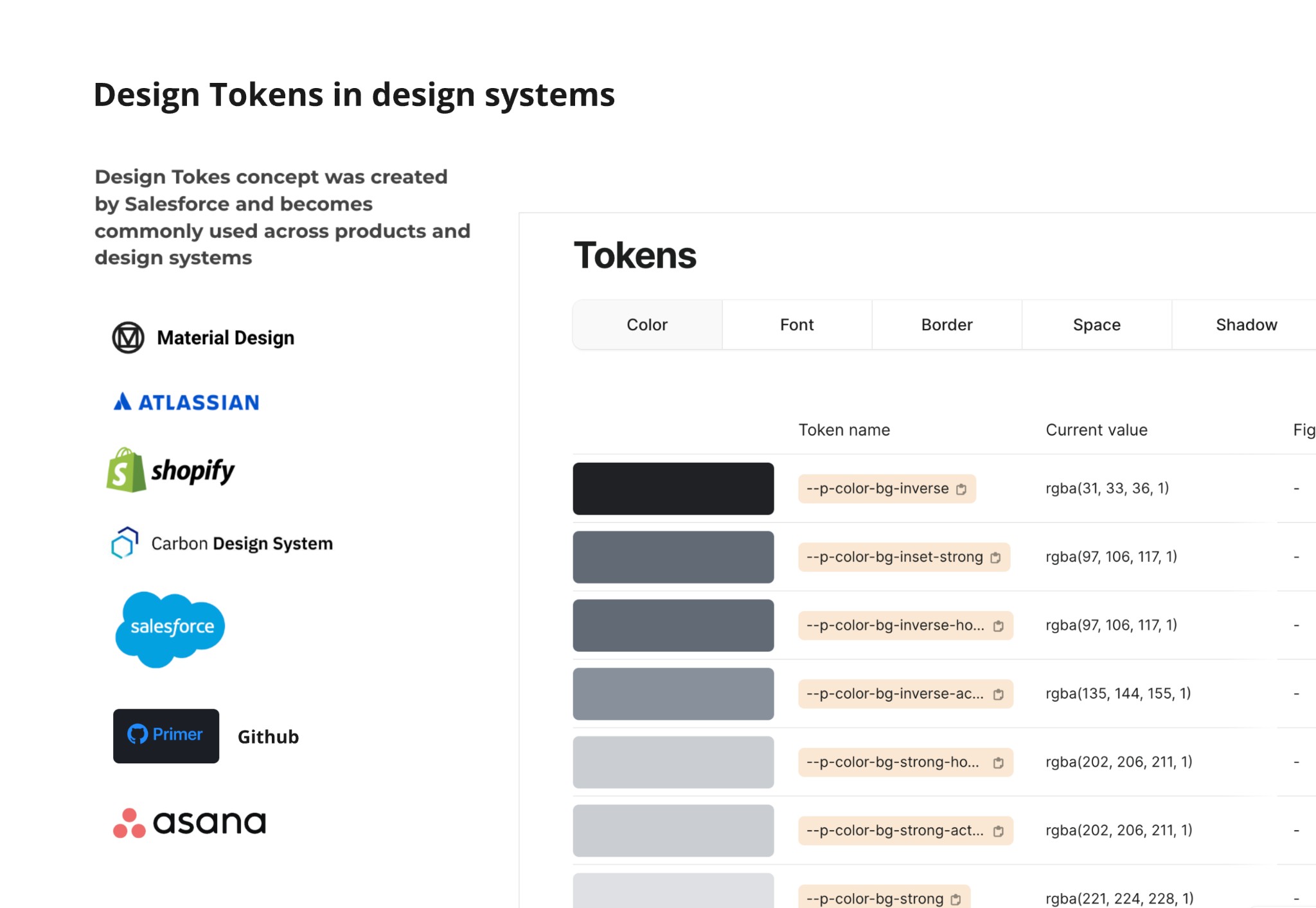
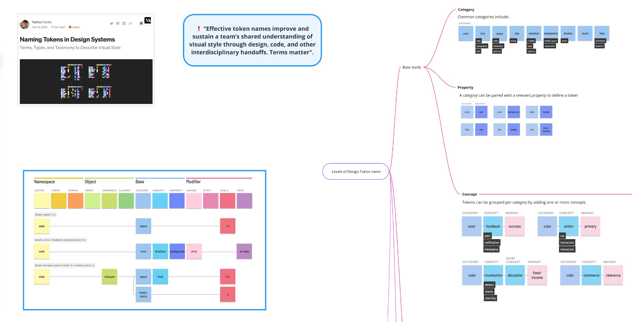
I researched design tokens as a foundation for consistent, multi-platform design.
Design System
I implemented a token-based design system to support the greenfield rebuild. It became a shared language for design and development.
We built a proof of concept connecting Figma tokens to iOS and Android. Tokens flowed into the apps, passed tests, and dark mode emerged naturally.
Android lead: 'most interesting project in years'
POC
Seller Journeys
Mapping the reality
We mapped app and web listing flows in production and uncovered undocumented logic and inconsistencies.
Defining priorities
Using a customer journey map, we identified friction points and focused on simplifying the most critical steps.
Designing a clearer flow
We redesigned listing creation and management journeys, simplifying structure and reducing friction. The new design system enabled consistent patterns across categories and surfaces.
Validating before release
We tested the updated journeys through moderated usability sessions and refined based on feedback. The goal was confidence before launch, not perfection.
During the redesign, I completed a Mobile Apps Design Advanced course in evenings and weekends. I applied new learnings directly to the product as the rebuild progressed.
Learning in motion
Growth
Web-view shift
As development progressed, parts of the seller flow moved to WebView to meet delivery deadlines. While it meant letting go of our original plan, we focused on what mattered most: shipping a stable solution on time.
Joint effort: app + web teams
We ran 6 Android and 6 iOS moderated sessions on staging. Users gave a green light and helped surface issues we fixed before release.
Validation
Launch
The result was a more consistent and scalable mobile experience built on stronger foundations and ready for future growth.
The greenfield app launched on time with stable retention, increased replies, and improved revenue.
Impact
Design System as an Enabler
Creating a shared foundation to support a greenfield app rebuild and faster product delivery.
Problem
The legacy mobile app had no scalable UI foundation. App and web patterns were inconsistent, designers worked in silos, and engineers faced frequent UI changes, which made even small updates slow and risky.
Strategic Decision
To avoid recreating legacy UX and technical debt in the greenfield app, we deliberately invested in a design system before redesigning core journeys.
Discovery & Research
I started with an audit of the existing app and design assets to understand what was reusable, where inconsistencies existed, and which decisions had previously caused friction for design and engineering. In parallel, I reviewed established design systems to understand how they structure components and scale across products.
A recurring pattern was the use of design tokens to separate design decisions from implementation. I shared these findings with the design team and engineers to align on the direction early and validate that a token based approach would work for our technical setup.
To reassess the app's visual foundations, I ran unmoderated usability testing to evaluate typography options. I compared the existing font, Inter, with Nunito Sans and Readex Pro. Readex Pro performed strongest in side by side comparisons, scoring highest for trust, friendliness, and modernity while remaining professional and easy to read on mobile. Based on these results, it was selected as the new app typeface.
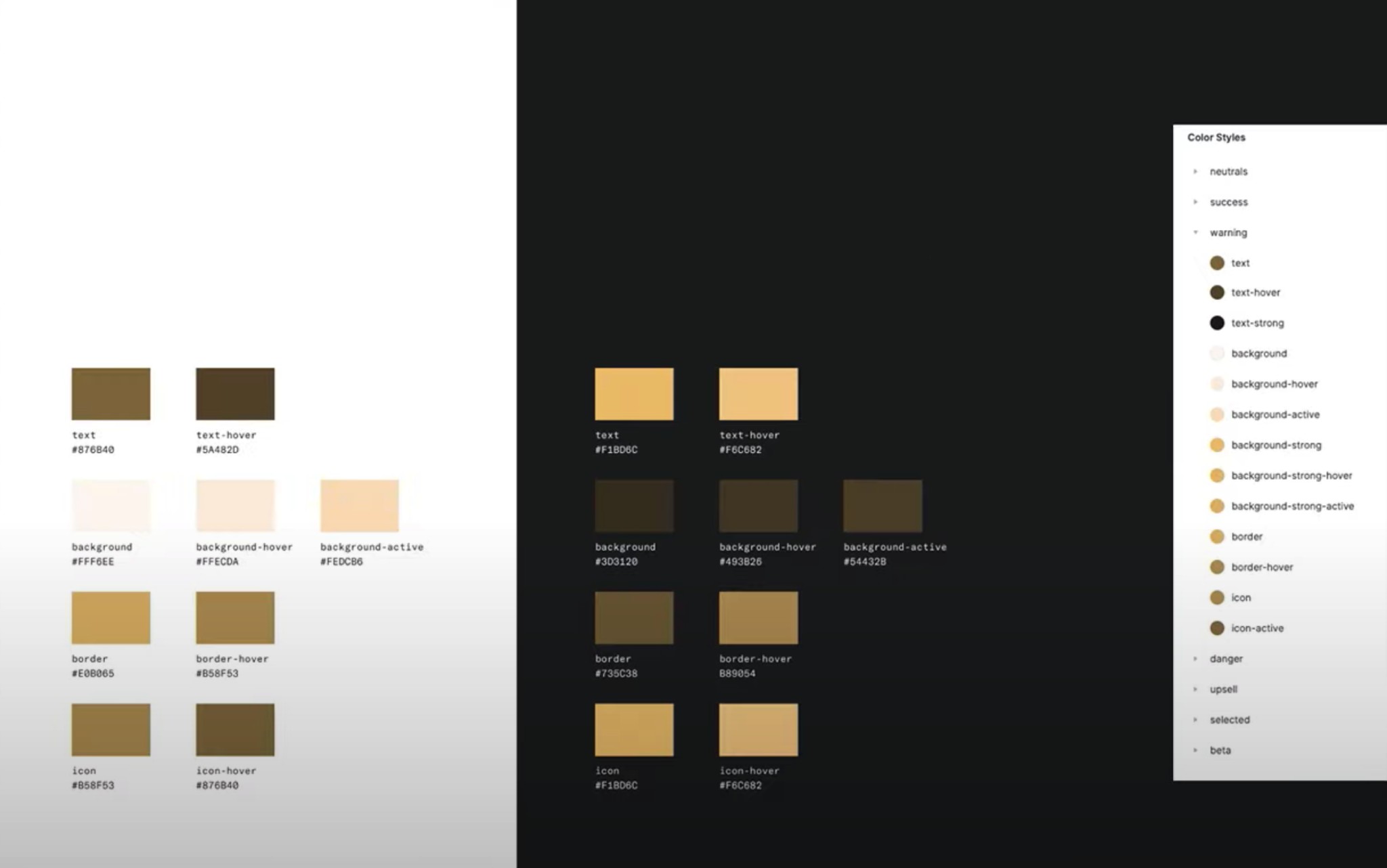
Alongside this, I carried out a focused design token discovery. As the app was being rebuilt from scratch across multiple platforms, design tokens provided a clear way to maintain consistency and establish a reliable path from design to code.
While dark mode was not part of the original scope, the token based setup made it possible to support it with minimal additional effort.
Solution
I built a token based design system using Token Studio, before Figma Variables were available. It was designed app first, with web specific needs scoped for a later phase to keep delivery focused.
Collaboration Model
To scale beyond a single owner, I set up a clear contribution model so multiple designers could create and update components safely, with shared rules for ownership, review, and consistency.
← Scroll to explore the full diagram →
Outcome
The design system reduced rework, improved collaboration with engineers, and made journey design faster and more consistent. It provided a strong foundation for the greenfield app launch and future product development.